

Key Takeaways
|
Choosing the right paint color comes down to a room’s mood, its natural and artificial light, and your existing décor. Always test real samples on your own walls first.
Choosing the right paint color is one of the most important decisions you’ll make during a home improvement project. Paint does much more than change the appearance of a room. It influences mood, enhances architectural features, affects perceived room size, and ties together furniture, flooring, and décor. A carefully selected color palette can make a home feel brighter, larger, warmer, or more inviting, while the wrong colors may leave spaces feeling disconnected or uncomfortable.
Many homeowners select paint colors based solely on a small paint chip or an online photo. Unfortunately, colors often look completely different once they’re applied to full walls and exposed to natural daylight, interior lighting, and surrounding finishes. Factors such as room orientation, ceiling height, flooring materials, cabinetry, and even nearby landscaping can influence how paint ultimately appears.
Choosing the right paint color should be a thoughtful process rather than a quick decision. Understanding the principles behind color selection helps you avoid expensive repainting and ensures your home reflects your personality while remaining visually balanced. Whether you’re refreshing a single bedroom or repainting your entire home, taking time to evaluate your space leads to results you’ll appreciate for years.
Understanding How Color Affects Mood and Atmosphere
Warm Colors Create Energy
Warm colors like soft reds, terracotta, warm beige, peach, and golden yellows naturally create inviting spaces. These shades encourage conversation and comfort, making them excellent choices for dining rooms, living rooms, and gathering spaces where family and guests spend time together.
Rather than overwhelming a room with bold colors, many homeowners choose softer warm tones that provide character without becoming visually tiring. Muted warm neutrals also remain stylish for many years.
Cool Colors Encourage Relaxation
Cool colors such as blues, greens, sage, and soft gray-blues help create calm environments. Bedrooms, bathrooms, and home offices often benefit from these shades because they reduce visual stimulation and promote relaxation or concentration.
For homes with abundant sunlight, cooler colors can also help spaces feel fresh and balanced throughout the day.
Neutral Colors Offer Flexibility
Neutral colors continue to be popular because they provide versatility. Whites, greiges, taupes, and soft grays allow artwork, furniture, flooring, and decorative accents to stand out while maintaining a clean appearance.
Choosing the right paint color doesn’t always mean selecting bold shades. Often, carefully chosen neutrals provide the timeless look homeowners appreciate while making future decorating updates much easier.
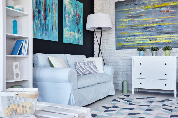
How Natural and Artificial Lighting Affect Paint Colors
Natural Light Changes Throughout the Day
Light is one of the biggest factors affecting paint color. Morning sunlight tends to be cooler, afternoon sunlight is warmer, and evening lighting introduces additional shadows. A paint color that appears bright at noon may seem significantly darker after sunset.
North-facing rooms typically receive cooler light that can make colors appear muted, while south-facing rooms enjoy warmer natural light that enhances many paint colors.
Artificial Lighting Alters Appearance
Different light bulbs produce different color temperatures. Warm LED bulbs may enhance cream or beige walls, while cool white bulbs can emphasize blue or gray undertones.
Before making a final decision, evaluate paint samples under the exact lighting conditions used every day, including lamps, recessed lighting, pendant fixtures, and natural daylight.
Paint Finish Also Matters
Color isn’t the only consideration. Matte finishes soften imperfections, eggshell provides subtle durability, satin offers easier cleaning, and semi-gloss reflects more light while increasing brightness.
The same paint color can appear different depending on the finish selected, making finish selection an important part of choosing the right paint color.

Choosing the Right Paint Colors for Each Room
Living Room
Living rooms benefit from welcoming colors that encourage relaxation and conversation. Soft neutrals, warm whites, earthy greens, and muted blues remain popular because they create comfortable gathering spaces while complementing different furniture styles.
Kitchen
Kitchens often perform well with brighter colors that create a clean appearance. Warm whites, soft gray, pale sage, or light greige work beautifully alongside wood cabinets, stone countertops, and stainless steel appliances.
Bedroom
Bedrooms should feel peaceful and restful. Soft blue, muted green, warm beige, dusty lavender, and gentle gray all help create relaxing environments suitable for better sleep.
Bathroom
Bathrooms usually benefit from crisp colors that maximize brightness. White, pale blue, soft green, and light gray create fresh spaces that feel clean while reflecting available light.
Home Office
A productive workspace benefits from balanced colors that reduce distraction. Muted blues, greens, and sophisticated neutrals help maintain focus without making the room feel cold or sterile.
Hallways and Entryways
These transitional areas connect multiple rooms, making cohesive color selection especially important. Neutral tones often provide smooth visual flow throughout the home while allowing adjoining rooms to complement one another.

How Existing Furniture and Décor Influence Color Selection
Build Around Permanent Features
Before selecting paint, evaluate flooring, countertops, cabinetry, fireplaces, tile, and built-in features. These elements are typically expensive to replace and should influence your color palette.
Coordinate With Furnishings
Your sofa, dining table, rugs, curtains, artwork, and decorative accessories should complement your paint rather than compete with it. Pulling subtle colors from existing fabrics often creates harmonious interiors.
Maintain Color Flow
Rather than choosing entirely different colors for every room, develop a coordinated palette with complementary shades. This creates continuity throughout the home while allowing each room to maintain its own personality.
How to Test Paint Colors Before Making a Final Decision
Purchase Sample Sizes
Small paint samples are inexpensive compared to repainting entire rooms. Apply large sample sections directly onto multiple walls instead of relying solely on tiny color cards.
Observe Throughout the Day
View samples during morning, afternoon, evening, and nighttime lighting conditions. Pay attention to how changing sunlight affects undertones and overall appearance.
Compare With Existing Materials
Stand back and evaluate how paint interacts with flooring, furniture, cabinets, trim, artwork, and window treatments before making your final decision.
Testing removes uncertainty and significantly improves the likelihood of choosing the right paint color the first time.

Common Paint Color Mistakes Homeowners Make
Choosing Paint Before Furnishings
Selecting paint before furniture often limits decorating flexibility. Since paint offers thousands of options, it’s generally easier to match paint to furnishings than the reverse.
Ignoring Undertones
White isn’t always pure white, and gray isn’t always neutral. Many colors contain blue, green, pink, or yellow undertones that become obvious once applied across entire walls.
Following Trends Alone
Trending colors can be inspiring, but they shouldn’t outweigh your home’s architecture, natural lighting, or personal preferences. Timeless selections usually provide greater long-term satisfaction.
Skipping Sample Testing
Perhaps the most common mistake is purchasing gallons of paint without testing samples first. This simple step prevents costly surprises after application.
Get Expert Help Choosing the Perfect Paint Colors for Your Home
Choosing the right paint color is part art and part method, and the payoff is a home that feels cohesive, comfortable, and unmistakably yours. When you want a second opinion or a flawless finish, it helps to work with a team that has guided thousands of these decisions. As a trusted Bay Area commercial painting contractor and residential painter based in Marin and the San Francisco Bay Area, McCarthy Painting brings color guidance and lasting craftsmanship to every project.
At McCarthy Painting, we provide expert residential and commercial painting services across San Francisco, Marin, and surrounding California areas, including specialized protective coatings, surface preparation, and long-lasting exterior solutions. Our team ensures proper application and durability for both homes and commercial properties, delivering high-quality finishes built to withstand time and weather.
Whether you’re updating a single room or planning a complete property makeover, our experienced painters are ready to help you achieve exceptional results. Contact McCarthy Painting today at 415-383-2640 to schedule your consultation.

Frequently Asked Questions
How many paint colors should I use in one house?
Most homes look cohesive with three to five complementary colors used throughout the interior. This approach creates variety while maintaining visual continuity from room to room.
Should my ceilings always be white?
Not necessarily. White ceilings remain popular because they reflect light and create height, but soft creams, light grays, or matching wall colors can add warmth and architectural interest depending on the space.
Do darker colors really make a small room feel smaller?
Not always. While lighter colors often make rooms feel more open, darker shades can add depth and create a cozy atmosphere when balanced with adequate lighting and thoughtful furnishings.
How do I pick a color that works with my existing furniture I’m not replacing?
Start by identifying the undertones in your furniture, flooring, rugs, and décor. Then choose paint colors that complement those undertones instead of competing with them.
Can I use the same color throughout my whole house?
Yes. Using one primary color with subtle variations in accent walls, trim, or adjoining rooms creates a cohesive design that feels spacious, timeless, and professionally planned.

Editorial Review by Greg Owens, Owner & CEO, McCarthy Painting Company
Greg Owens is the Owner and CEO of McCarthy Painting Company, a family-owned painting contractor serving Marin County and the San Francisco Bay Area since 1969. Having worked with the company since 1990, Greg has more than three decades of hands-on experience in residential and commercial painting, surface preparation, protective coatings, wood restoration, and long-term property maintenance. Under his leadership, McCarthy Painting has completed projects for homeowners, commercial property managers, and organizations throughout the Bay Area while maintaining a reputation for quality craftsmanship, professionalism, and exceptional customer service. Greg reviews educational content to help property owners make informed decisions about painting, maintenance, and protecting their investment.